The Craft Collective

platform design


Opportunity

The arts and crafts community is eager to share and gather inspiration, but with its wide range of ages, technology can be a barrier. Since physical craft stores are a centralized meeting place for this community, we posited that a digital content tool in a physical craft store could be a valuable way for crafters to get inspiration and inspire others.

Process

We gathered data on our community through observations at craft stores and extensive phone interviews. After drafting personas, a user journey, and design goals based on this data, we explored several conceptual designs, settling on an in-store display / in-store camera / app system. We created detailed requirements and used future user journeys and wireframes to convey the design. We evaluated our draft interface with five craft enthusiasts using a paper prototype and distilled these results into concrete next steps for the design.


Our team was highly collaborative. I acted as project manager, chose the target community, conducted observations, drafted design goals, sketched conceptual designs, contributed to wireframe layout ideas, led the evaluation, and took responsibility for the copy in the report.

Outcome

The final Craft Collective platform allows users of all different technology backgrounds to both be inspired and inspire others. Our team received a 'distinction' in our Interaction Design course for this work.

team

Julie Hobson (me)

Cansu Sayici

Amit Sheinholtz

Nick Willis

user research

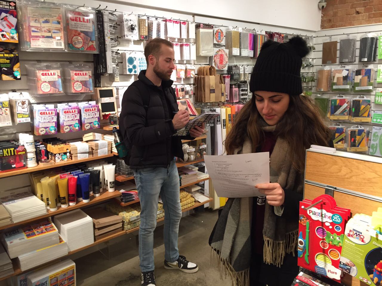
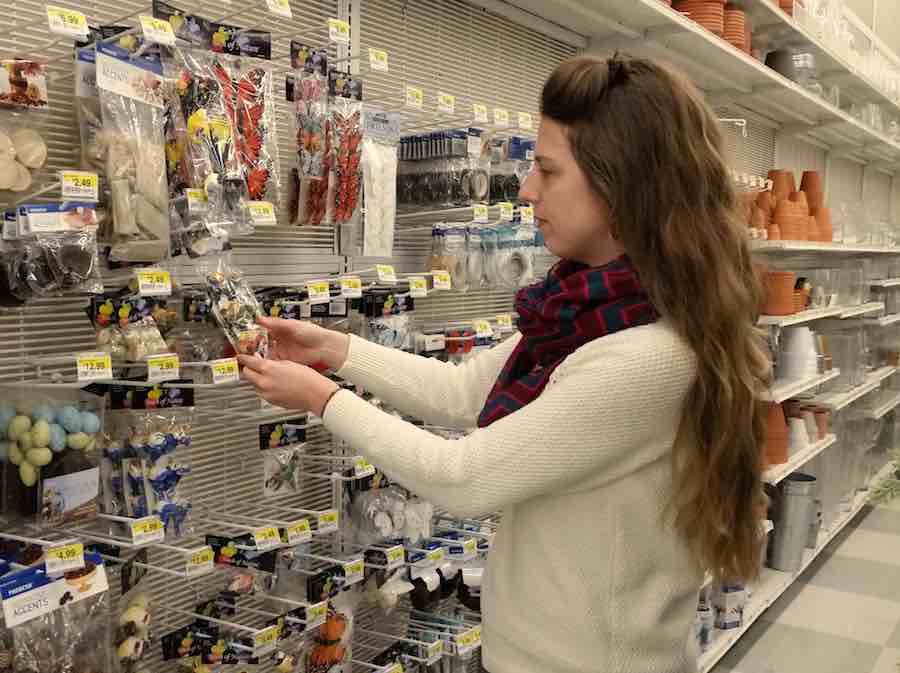
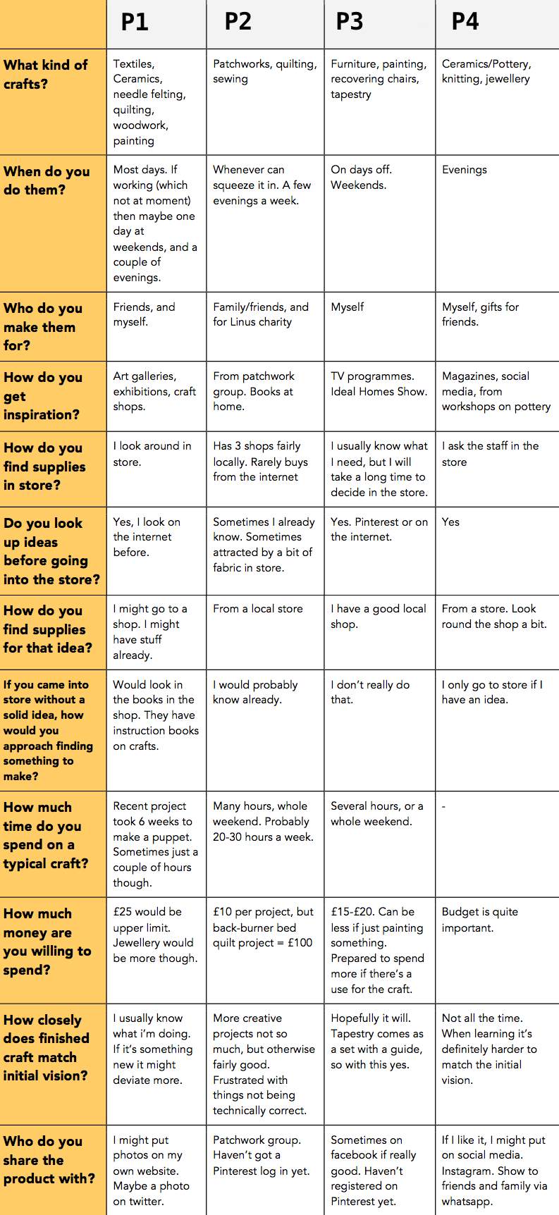
We started the project by taking a team field trip to a local craft store, where we observed customer behavior and spoke to several store employees and customers. The shop staff provided some excellent feedback about the sort of people who visit the shop and their behavior. We then created structured interview questions from our initial observations and conducted eight phone interviews with craft hobbyists in our social networks.


Teammates scouring a craft store

julie observing in a craft store


table of interview data from first four interviews

affinity diagram

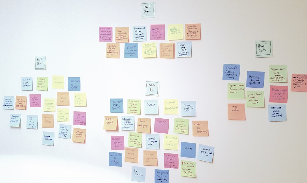
The structured questions in our interviews made data analysis straightforward. We grouped all the interview answers into four general categories to find trends: shopping habits, crafting style, inspiration sources, and finished craft sharing habits.

post-it notes on wall, clustered by theme

personas

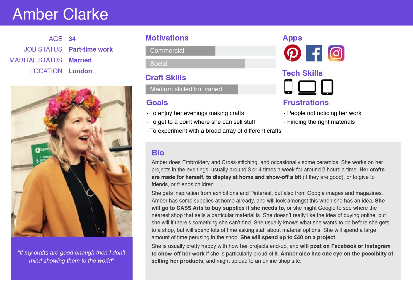
From the user research data, it appeared that we were seeing two distinct types of user within our community: (1) younger, tech-savvy crafters who want to share their work with the world, and (2) older, tech-resistant crafters who primarily want to share their work with friends only. As a team we created 'Amber' and 'Alice' to represent these divergent but symbiotic users; team member Nick Willis filled out the details to bring them to life.


existing user journey

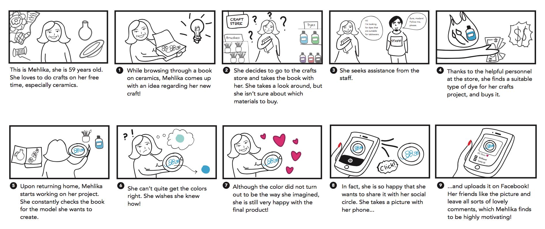
To illustrate the current habits and speedbumps for our crafting community, we chose a story featuring a particular individual from our interviews. We decided to focus on her challenge to find materials, reliance on instructions, and desire to share her work. Team member Cansu brought these ideas to life, writing and drawing this and all of the user journeys for this project.

early sketches

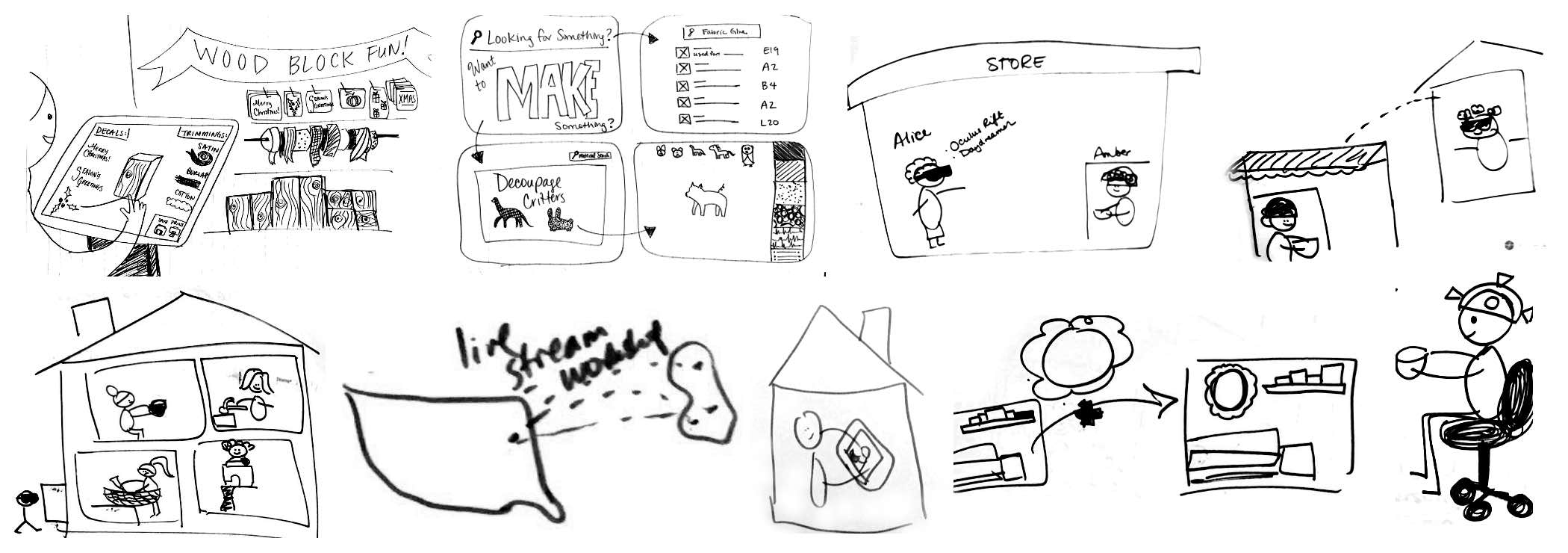
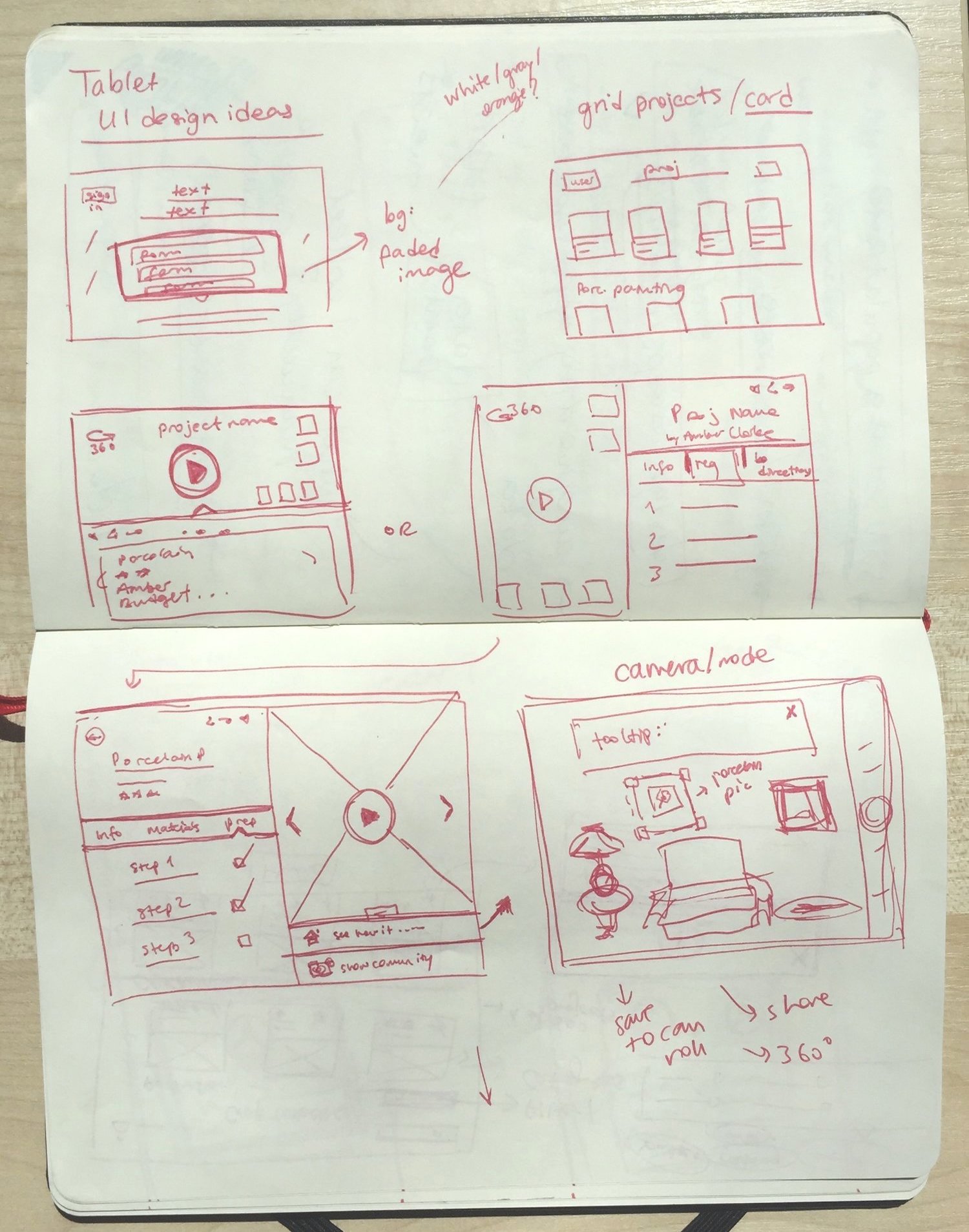
As a team, we explored several conceptual designs, including live streaming tutorials, virtual reality, and an entirely in-store system, before finally settling on our final design. Here are some of my sketches from our iterative process.


a collection of sketches exploring various design ideas: VR, live streaming, and in-home placement

final design

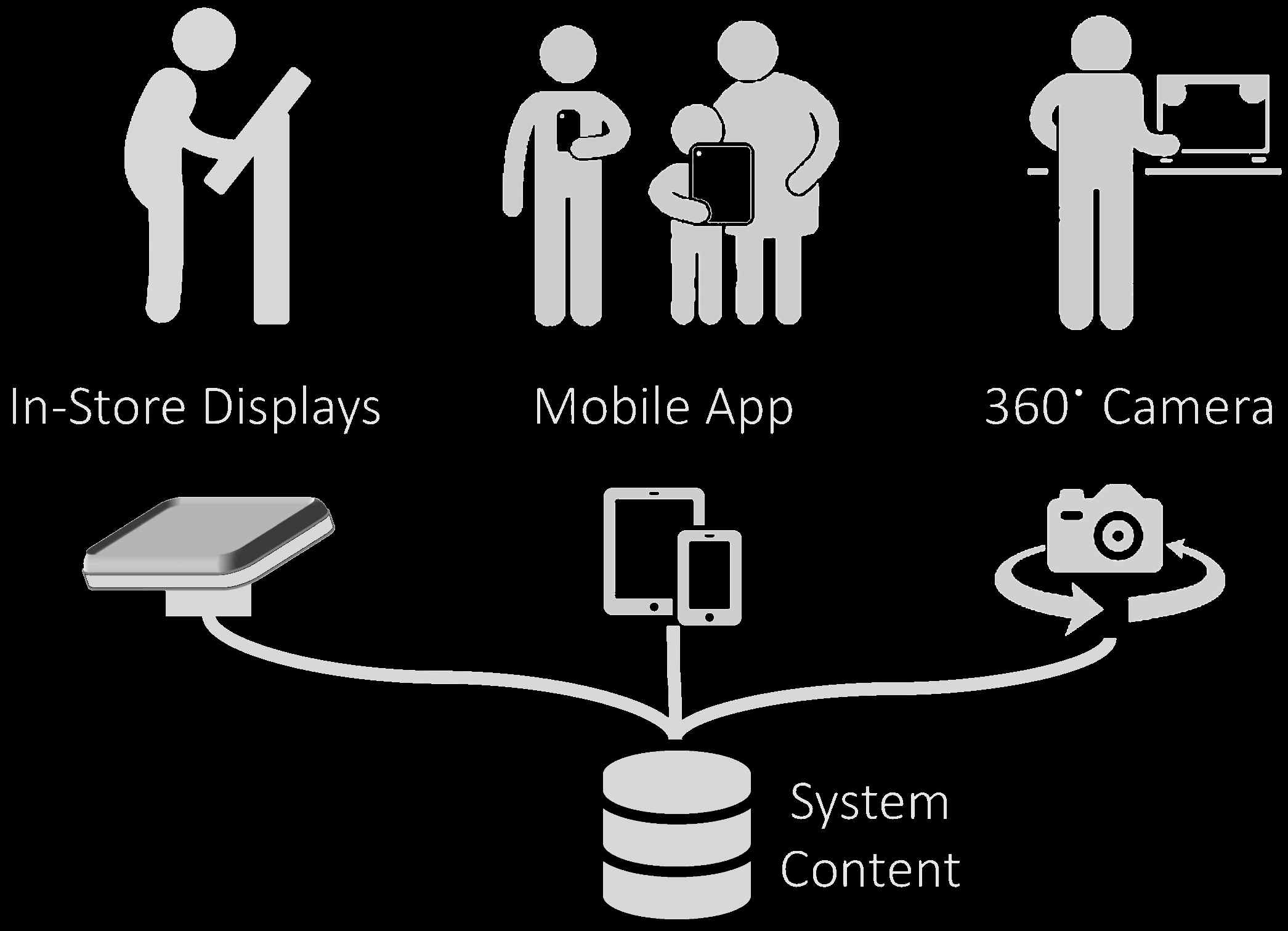
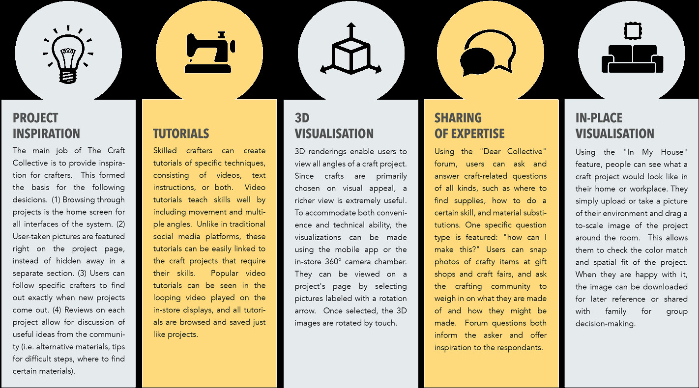
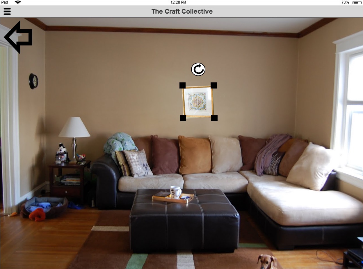
The Craft Collective, our final design, is a crafting inspiration tool consisting of large in-store displays, a mobile application, and an in-store 360-degree camera setup. Below the hood, each component talks to one database of craft projects and tutorials. Additional features include 3-D visualizations of craft products, sharing expertise through "Dear Collective" forum, and a visualization tool to virtually place a craft project in your home.

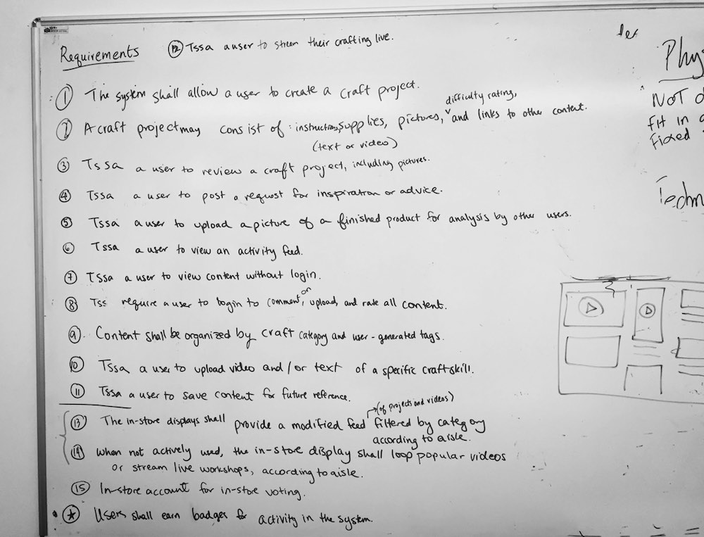
list of requirements for the craft platform, written on a whiteboard
diagram showing the structure of the platform: in-store displays, mobile app, and 360 degree camera all backed by a central database
5 system features: inspiration, tutorials, 3d visuals, expertise sharing, in-place visualization

future user journeys

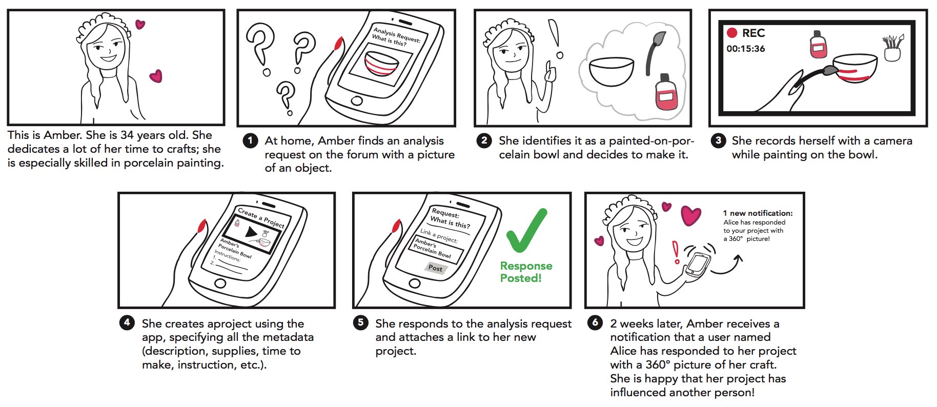
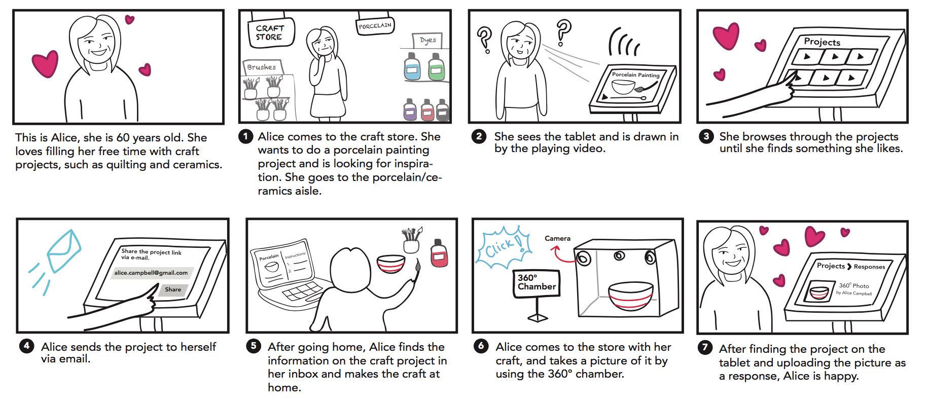
We chose to portray our platform design in two 'future' user journeys: one for each persona. Our two scenarios focus on the two main goals of the project: CREATION of content (Amber) and the CURATION of content (Alice).


wireframes

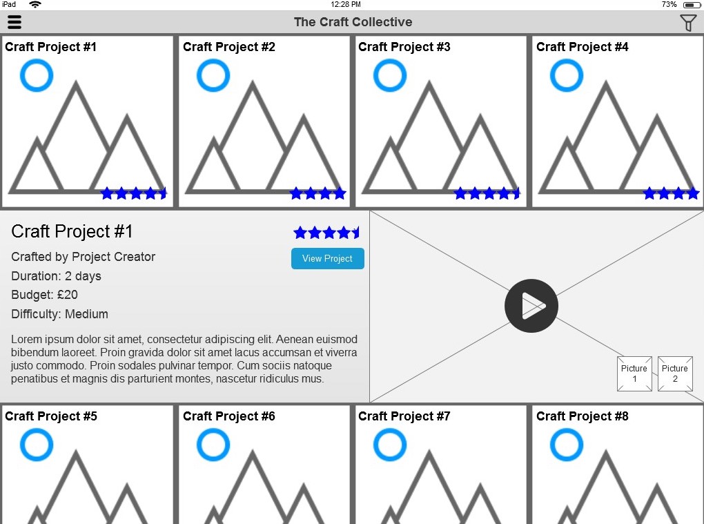
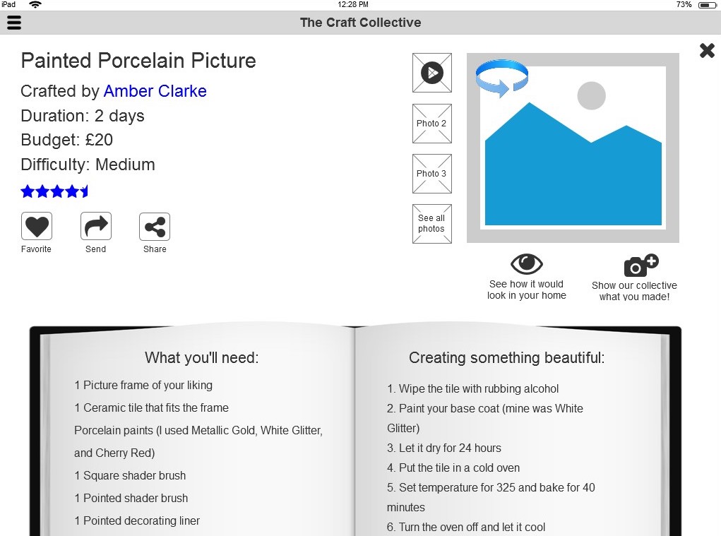
In the design of the wireframes, we first turned to gallery pages of popular services such as Google Images and Netflix for layout considerations to leverage people's existing expectations and previous interactions to facilitate a sense of familiarity with our system. This led to the project browsing screen, which we aimed to make as visual as possible, emphasizing project pictures and minimizing text. A hamburger menu was implemented to minimize disruptions in the visual browse screen. On the project page, we aimed to make all project information on one page for convenience while following the instructions. We planned basic page layouts as a team, then team member Amit Sheinholtz captured the details in the wireframes below.


usability evaluation

I planned and led the usability evaluation, which we conducted live with five participants. Using a paper prototype, we asked participants to find a project and use the in-place visualization feature.


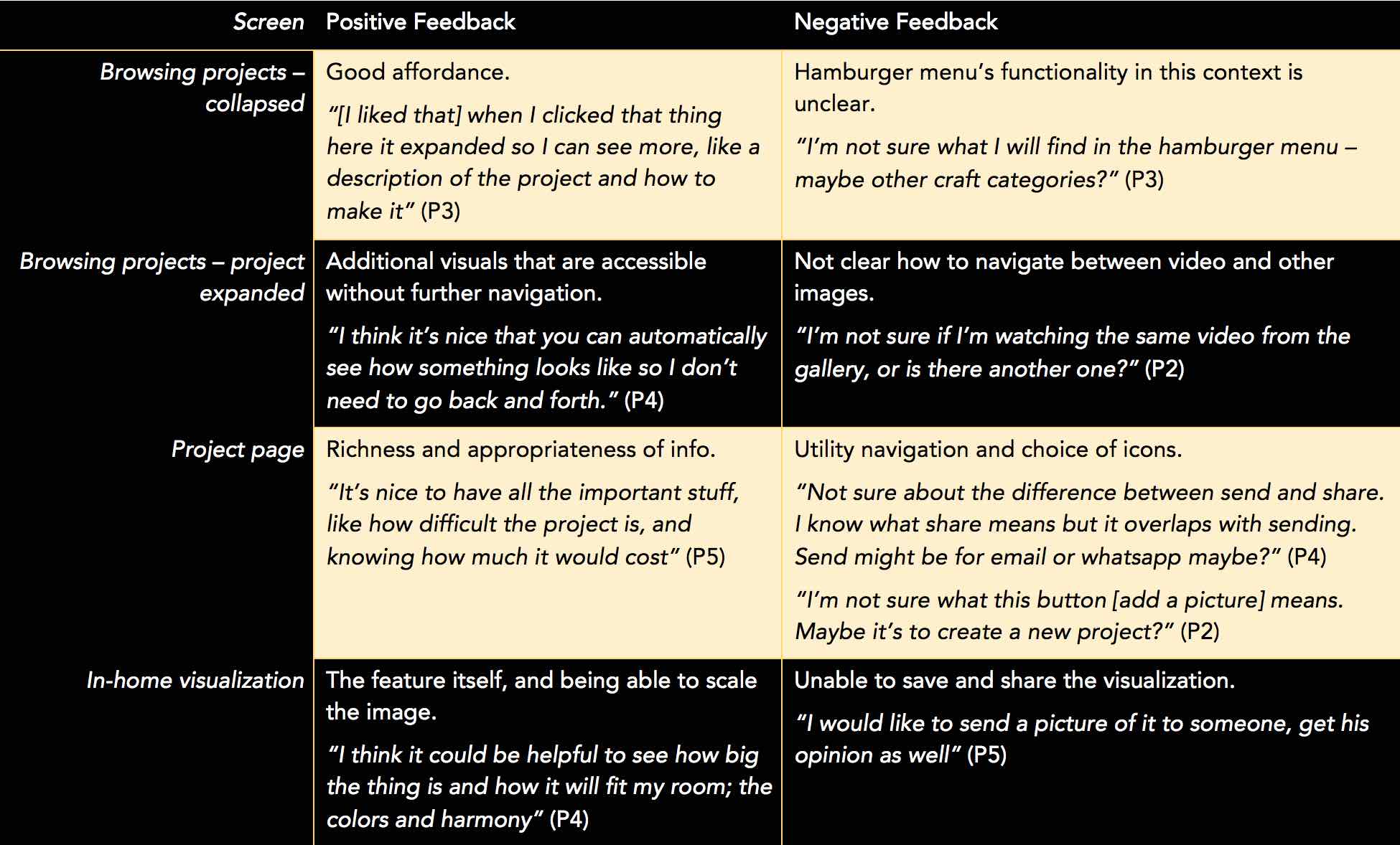
The most constructive feedback of the evaluation centered around the project page. Every user struggled with the Send (send the project via email) and Share (share on social media) buttons. When asked what they each do, participants had a difficult time understanding either the function of the Send button or the difference between the buttons. In our next design revision, we would likely unify those functions in one button, as several common social media platforms do. However, we would need to conduct a further evaluation with older users (our secondary persona), as the participants in our evaluation were all younger users (our primary persona). Older users may not be as familiar with the concept of sharing, and so might need the trigger word "send" to know that emailing the project is possible.


Overall, the evaluation was very encouraging. All participants spoke well of the system, praising the simplicity of its navigation and the helpfulness of its features.


user testing using a paper prototype


table of feedback from user testing

VISUAL DESIGN & PROTOTYPE

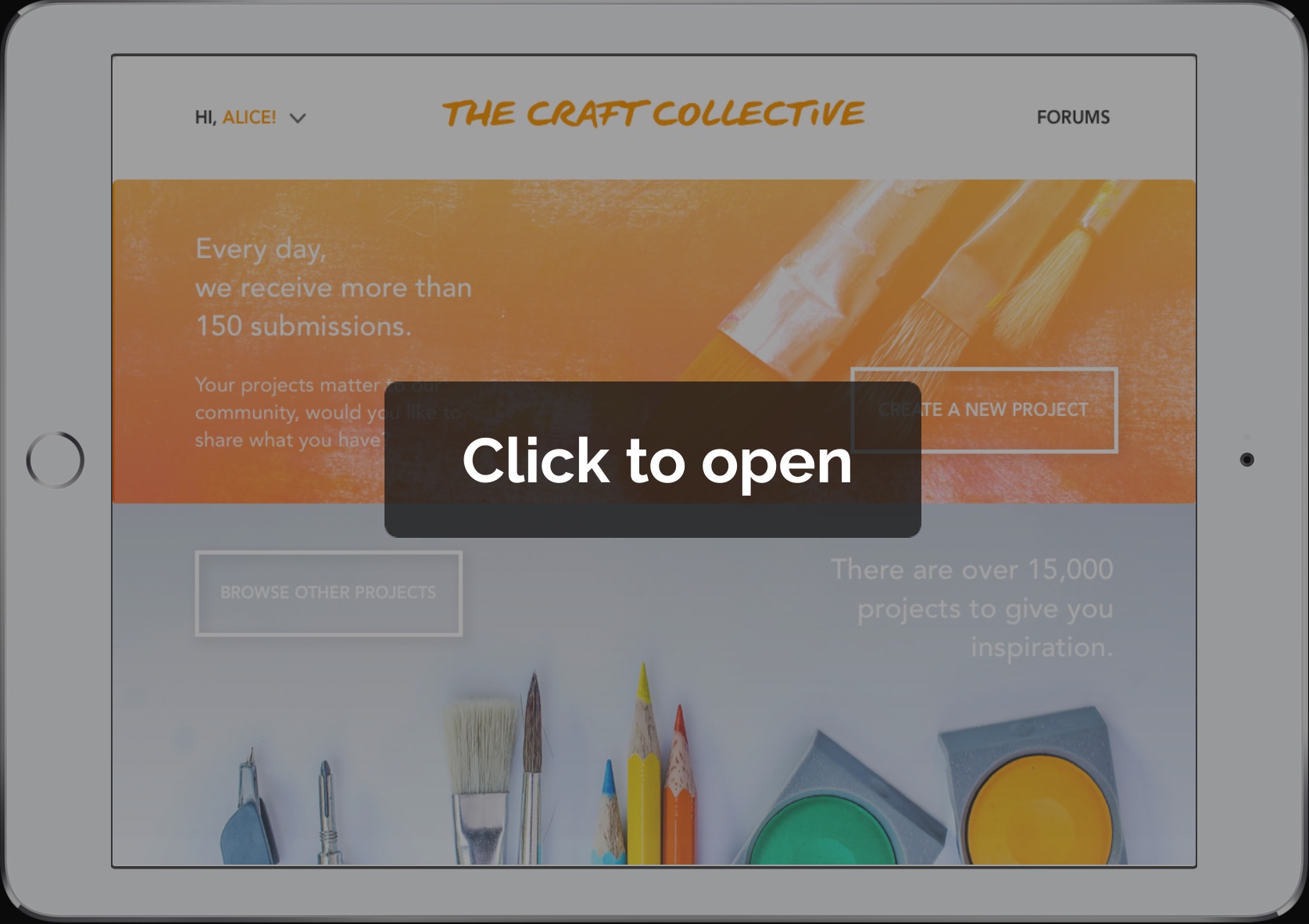
After the course, team member Cansu Sayici used our usability evaluation findings to revise our draft wireframes and produce this stunning visual design and clickable prototype.