Opportunity
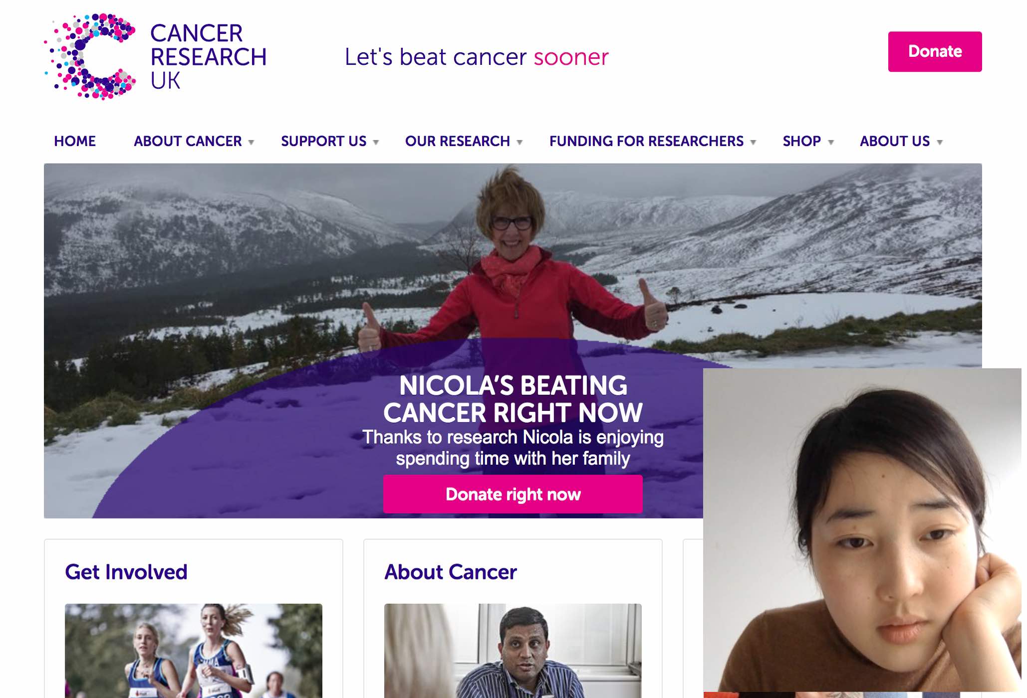
Cancer Research UK is the largest and most visible charity raising funds for cancer research in the UK. For my master's course in UX evaluation, I was asked to evaluate their website using three major questions. How does the site compare to competitor charity sites, what message is the homepage conveying to users, and how can the usability of the online shop and events sections be improved?
Process
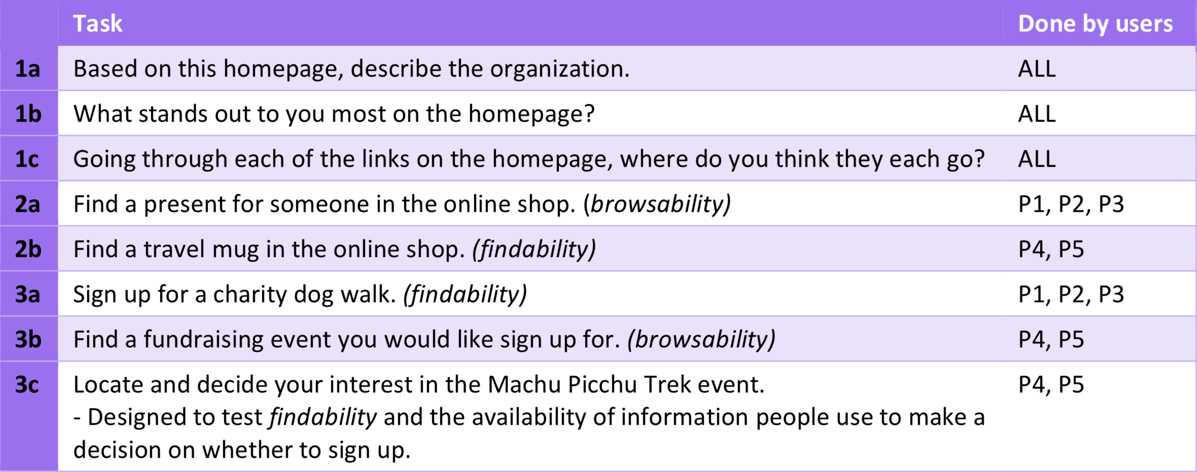
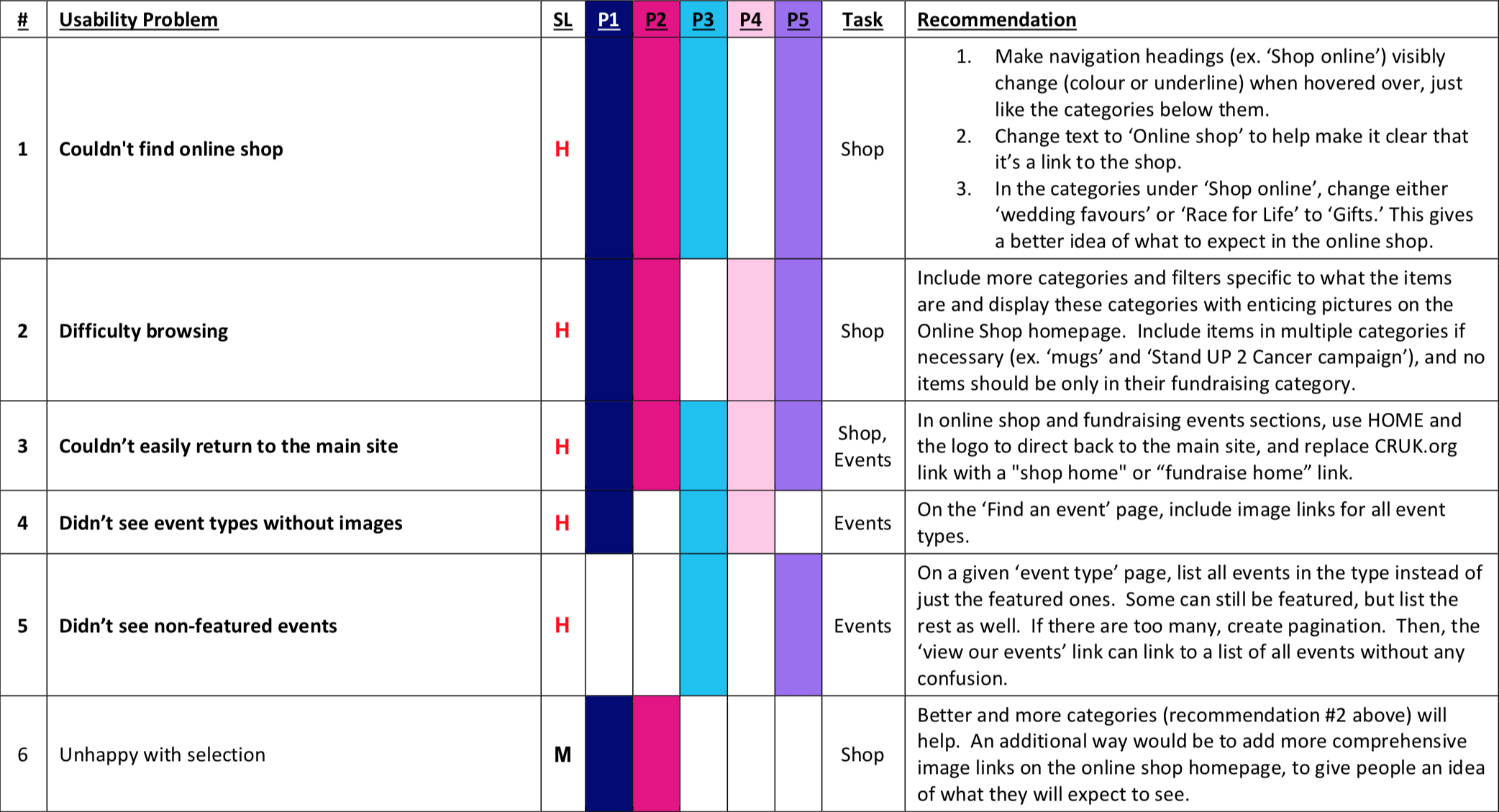
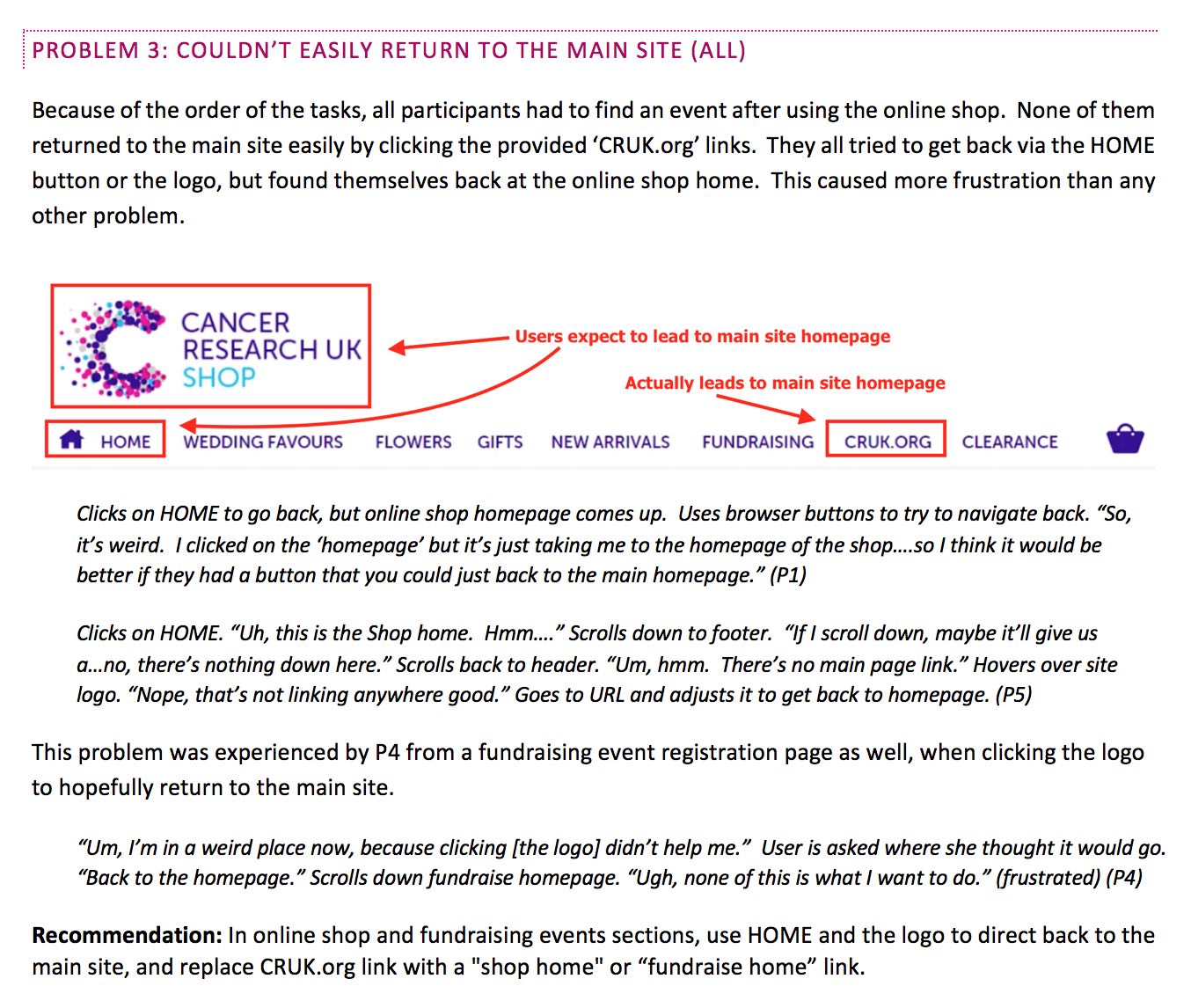
I conducted a benchmark competitive review and remote moderated usability testing. To conduct the user testing, I identified tasks that would bring out people's thoughts about the homepage and identify usability issues in the online shop and event sections. I then tested the website with five users remotely and identified 15 usability issues. Five of these were chosen as 'primary barriers' because they hindered users from actually completing the intended tasks. Participants' subjective feelings about the homepage were validated with quantitative data from an online survey of 35 people.
Outcome
A detailed written report was produced for Cancer Research UK, outlining the results of the competitive analysis and all usability issues found, with special attention to the five primary barriers. The results were also orally presented to course instructors, including a highlights reel of the moderated user testing. This work was given an 'outstanding' mark in my Evaluating Interactive Systems course.


