Rockstar sunday school

website design


Opportunity

Most Sunday School teachers rely heavily on ideas from the web to teach their classes. As a former volunteer teacher of "children's church" myself, I have experienced frustration with currently available tools such as Google and Pinterest. These provide the searcher with many hits, but sorting through these can be difficult. I surmised that I was not alone in my frustrations. My mission, therefore, was to create a way for this group to quickly and easily find teaching ideas appropriate for their classrooms.

Process

I conducted interviews and questionnaires to explore the volunteer teaching domain and used a card sort to start to organize teaching activities for the website. From this information, I designed a sitemap and accompanying user journey to explore a possible site structure. I tested this site using clickable wireframes and designed a visual look for the site.

Outcome

My usability evaluation resulted in all six people completing both tasks quickly and without issue, but I did come away with several useful findings which I hope to incorporate into the next design iteration. I received a 'distinction' in my Information Architecture course for this work.

user research

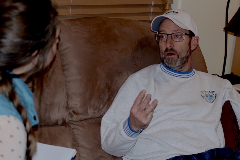
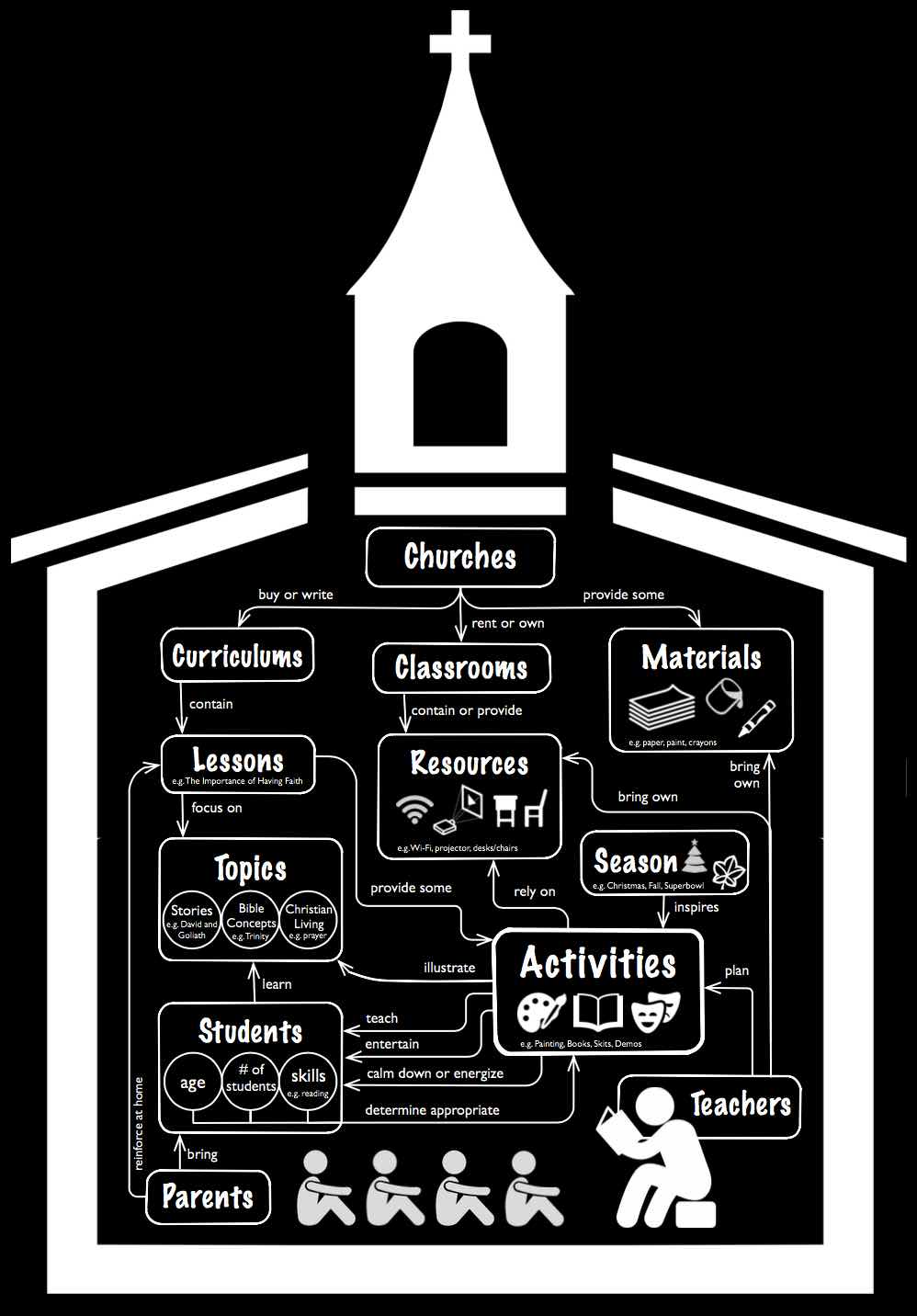
To start to understand the context of searching for teaching ideas in this community, I interviewed three Sunday School teachers in depth and reached out to ten more with a questionnaire. From this user research, I created a domain model to explore the way activities are chosen: by overall topic given by the curriculum (often a story from the Bible), characteristics of the students, resources available, and materials needed.


interviewing a Sunday School teacher


sitemap & task flow

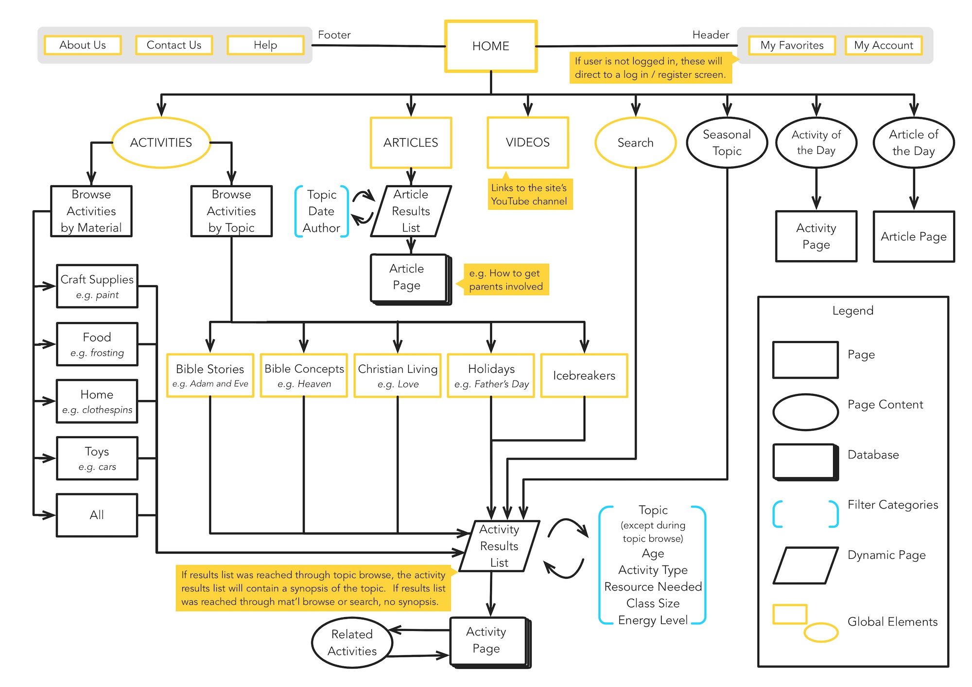
Sitemap of Sunday School website


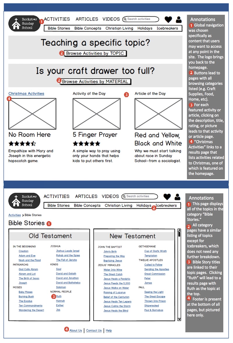
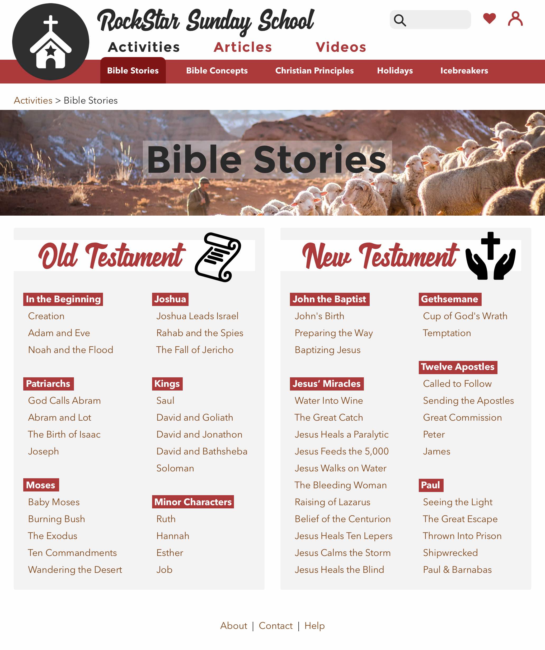
I conducted a card sort with ten Sunday School teachers to inform the structure of my site. The most difficult topic category to organise was Bible Stories. All the stories occur somewhere in the Bible, so putting them in Bible order is a good start. However, some stories occur in multiple places and even more problematic, most of my users don't know offhand where many stories are located. This is because these stories are almost exclusively mentioned, told, and remembered by name, not by chapter and verse numbers. Therefore, I used a mix of exact schemes (old/new testaments) to help users narrow down more quickly with things they generally do know, and ambiguous schemes (topic-based) to assist them in finding the specific story.


Even with this scheme, people will still need to scan the contents of each topic to make sure it contains what they want. Therefore, I chose to place all the Bible stories on one page, with clustering to separate them out into Old/New Testaments and into categories. My evaluation showed that people found this method extremely useful and were able to find the appropriate story quickly.


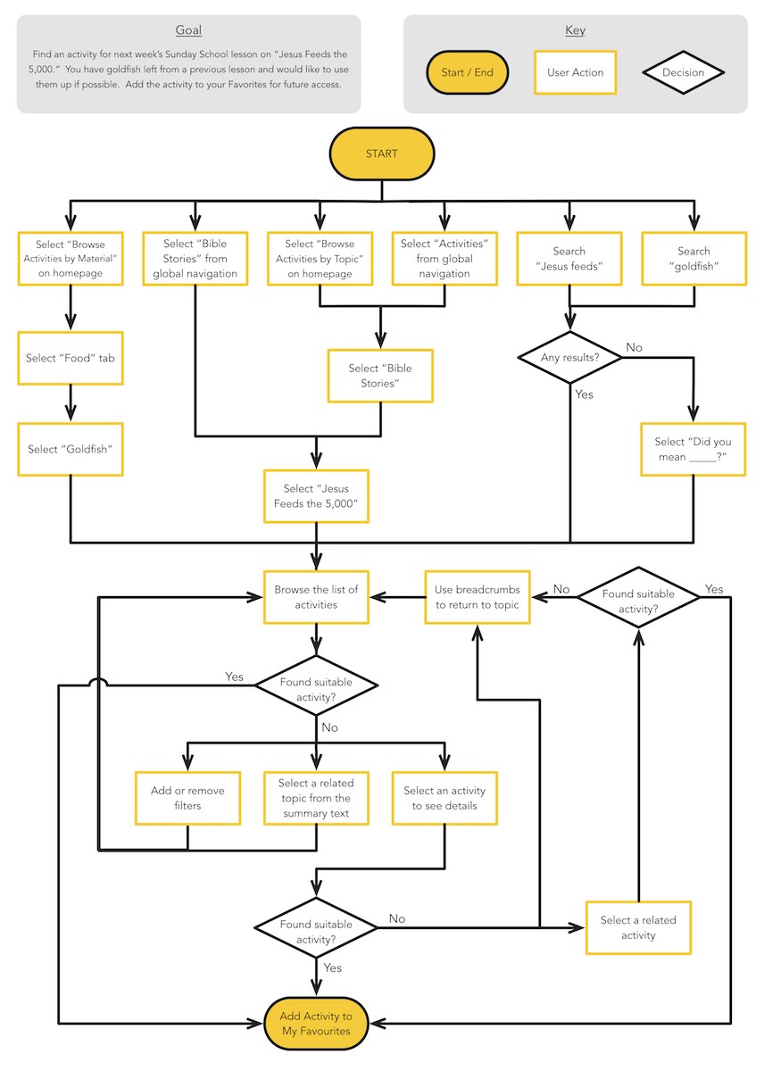
User journey of Sunday School website, showing a user's path from the intention to find an activity to the saving of the activing in favorites

wireframes

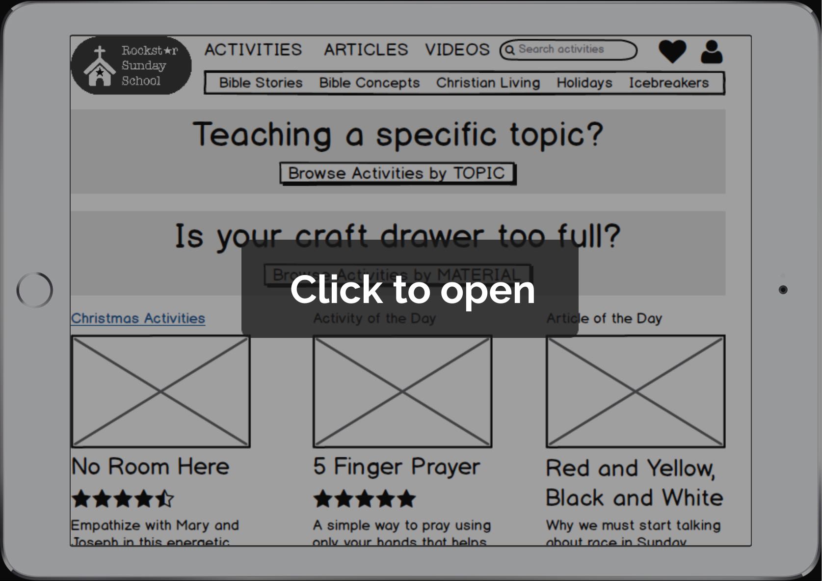
I created 13 clickable wireframes with Balsamiq to evaluate the site structure with six participants. I asked participants to think aloud while working through two tasks to find a suitable activity for their Sunday School lesson on Jesus' miraculous feeding of the multitudes. All six people completed both tasks quickly and without issue, but I did come away with several useful findings which I hope to incorporate into the next design iteration.

visual design

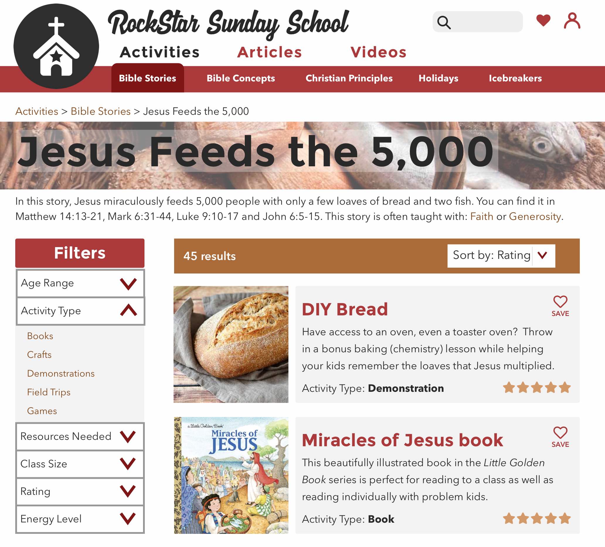
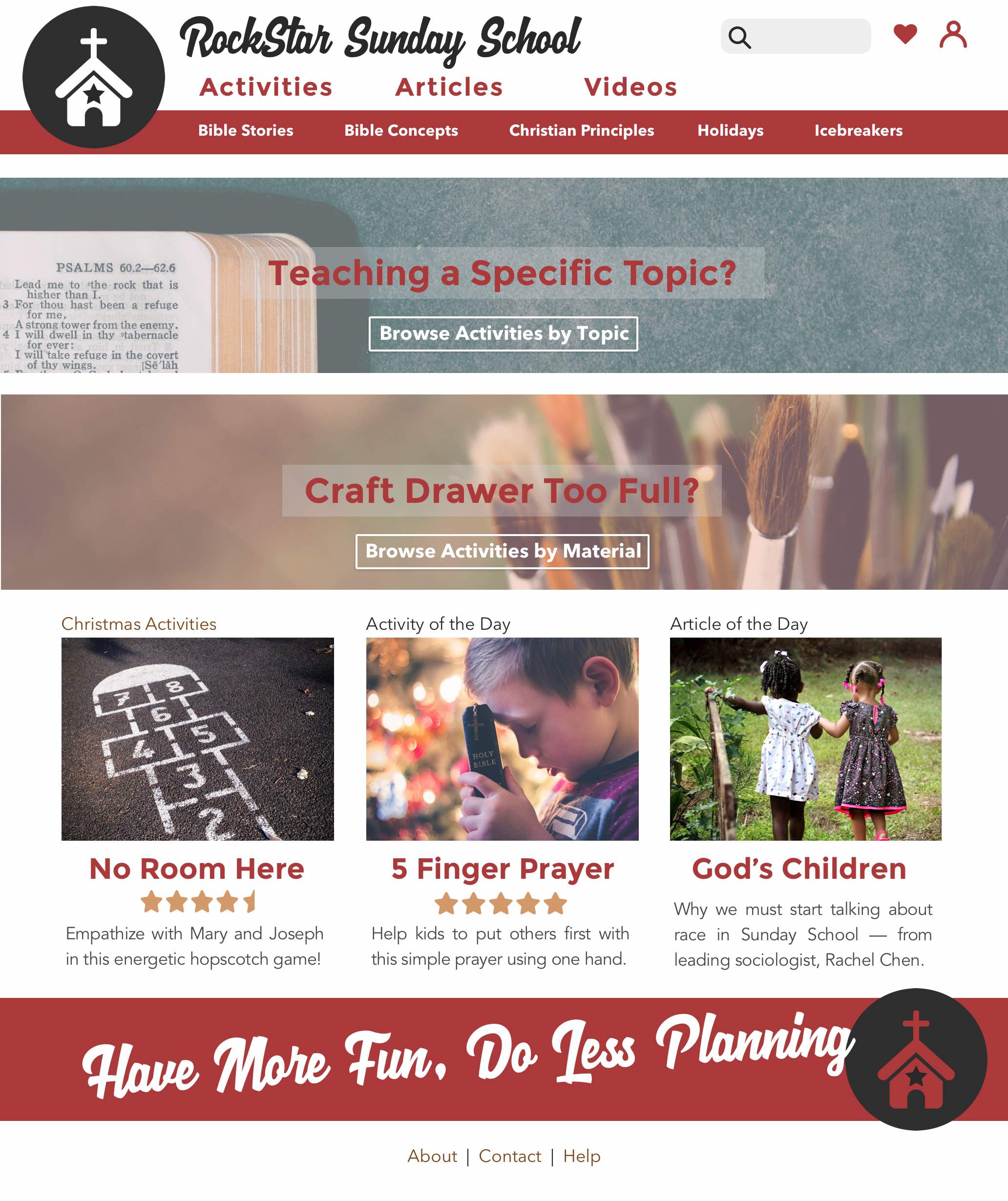
After the usability evaluation, I chose a look and feel for the website and used Sketch to mock up a few of the pages with a visual design.


Mocked up website, search results page

design specification

I used Sketch Measure and Markly to produce inspectable design specifications to communicate with developers.

Mocked up website shown on tablet with craft supplies nearby